Paul Revere Williams receives the AIA Gold Medal, Dec. 8, 2016
As far as I can figure, this is a Gold Medal of many firsts: first African-American architect, first Googie architect, first Hollywood Regency architect, first tract house architect, first Late Moderne architect, first Palm Springs architect, first Las Vegas architect (Denise Scott Brown and Robert Venturi did not actually build in LV, as Williams did.) Perhaps we're getting away from the stranglehold of high arters?
The original AIA press release repeated a myth that has been going around for a while now: that Williams designed the Theme Building at LAX. It was corrected, but it shows the tremendous difficulty in correcting a rumor once it has been let loose. Williams was part of a consortium that designed LAX, including lead architects William Pereir and Charles Luckman, and Welton Becket. As a matter of record, the Theme Building itself was designed out of the Pereira office, according to the building's engineer, the brilliant Richard Bradshaw (who also deserves a Gold Medal of some kind!)
AIA Press release:
https://www.aia.org/showcases/23066-paul-revere-williams-faia?utm_source=Real+Magnet&utm_medium=Email&utm_content=2490837301&utm_campaign=106009838
ArchDaily article on 2017 Gold Medal
http://www.archdaily.com/801106/black-and-gold-how-paul-revere-williams-became-the-first-african-american-to-win-the-aias-highest-honor?utm_source=dlvr.it&utm_medium=gplus

Friday, December 9, 2016
Wednesday, August 14, 2013
The oldest McDonald's as Architecture
 |
| McDonald's, Lakewood and Florence, Downey, CA. 1953. Stanley Clark Meston, architect |
Sixty years ago this Sunday, the oldest remaining McDonald's stand opened for business at the corner of Lakewood and Florence in Downey, CA. Its yellow neon-lined arches piercing its dynamic roof wedge, and its wrap-around sheets of slanting glass make an unmistakeable icon. And it deserves to be called an icon, no matter how often that over-used label is applied to eye-catching but less significant buildings.
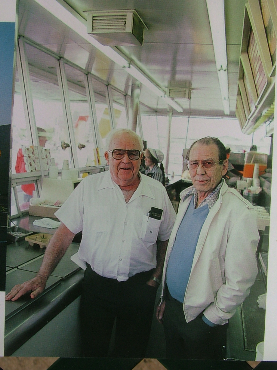 |
Original franchisees
Roger Williams (l),
Bud Landon (r). 1983
|
Since it qualified for the National Register of Historic Places in 1983, Downey's McDonald's has also been certifiably historic -- now for exactly half of its existence. If anyone cares to think about it, that fact comes with a whole host of thorny questions and facts that shake up our ideas about what architecture is, where it comes from, and what makes a good architect.
Bud Landon and Roger Williams worked for General Petroleum in 1953 when Roger's brother-in-law, Neil Fox, told them of a good investment: two brothers in San Bernardino were franchising their hamburger stand idea, and Fox had purchased the first franchise. He opened the first golden-arched stand in Phoenix in June, 1953 (long since demolished.) Bud and Roger bought the second franchise and opened two months later.
 |
| Stanley Clark Meston, architect, 1983 |
Dick and Mac McDonald sweetened their franchise terms to interest people, but they did require Bud and Roger to use the design for the stand that they had developed with Fontana architect Stanley Clark Meston. It was a gem; on a tennis court, the three of them (with Meston's draftsman, Charles Fish) had laid out the exact measurements of every piece of equipment for maximum efficiency. Dick and Mac had operated their original stand since 1948, perfecting a limited-menu self-service system. Meston's building embodied that system, right down to the built-in advertising: Dick had suggested large arches so the stand would catch the eye of customers through their windshields as they went about their daily life in new suburbs like Downey. That town was booming with aerospace companies at the dawn of the space age. Meston gave those arches the space-age spring of a bounding parabola, and made sure they glowed with multi-hued radiating neon.
.JPG) |
| sign, 1960 |
It's a simple design and thoroughly and functionally Modern; if form follows function, one of a hamburger stand's functions is advertising. Not only was it made of modern steel and glass, it was plugged into the cultural zeitgeist of new technology that was changing the way everyone lived. Steel and glass office skyscrapers rose in America's city centers, kinetic Googie coffee shops appeared on major suburban corners, gleaming white refrigerators stood in every middle class kitchen in the new mass-produced Ranch Houses across the nation. Meston's McDonald's brought the same aesthetic to the roadside of everyday life.
It's also a design that can be critiqued; the way the arches plunge through the roof is slightly awkward. But more interesting is to compare it to another drive-in restaurant designed by a master of Modernism, Ludwig Mies van der Rohe, for Indianapolis in 1948. No one can deny Mies' credentials. The Hi-Way Drive-In tried out his universal vocabulary of steel and glass made famous in his 1956 Crown Hall at the Illinois Institute of Technology, where he taught: large steel trusses supported on steel columns at either end rose above the roofline. As the building's entire structural skeleton, exposed to view, they left the interior space open and the exterior walls entirely glass. It was a theoretical tour de force: technically exquisite, but functionally tin-eared. The Hi-Way Drive-in was never built. For all his fame, Mies did not know how to design a building to serve hamburgers to the growing suburban population of America. Stanley Meston did, even though you'll rarely read about him in history books.
 |
| Meston and Charles Fish's original rendering of prototype franchise design for McDonald brothers, 1953. (Charles Fish collection) |
There are many good reasons to visit the McDonald's in Downey this weekend to celebrate a piece of history, culture, and architecture. It is a time machine: you can still buy a burger, fries and shake by walking up to the outdoor service window, exactly as Downeyites did August 18, 1953. You can still eat in the comfort of your car. You can look inside to see the ice cream freezer where Ray Kroc, a salesman who came by to sell his MultiMix milkshake machine to Bud and Roger, sat when he got the idea to open his own McDonald's franchise back in Chicago. You can still see Downey, only fifteen minutes from downtown Los Angeles but still claiming its unique identity as builder of key parts of the Space Shuttle, and home to original musical talents from Pop's Karen and Richard Carpenter to Rockabilly's Blasters.
It's that strong civic sense that helped to preserve this piece of American history when McDonald's Corporation demolished scores of them nationwide. Back in the early 1990s, the McDonald's Corporation wanted to tear this one down after they had bought out Roger and Bud's franchise. Downey citizens, lead by Mayor Joyce Lawrence and aided by the Los Angeles Conservancy, stalled demolition until wiser corporate heads prevailed, and the stand was restored and re-opened in 1996.
In 1983, the idea of a McDonalds being a historic landmark was a punchline, even among architectural preservationists. How could a hamburger stand be historic, let alone significant? How could a suburban building be good architecture? How could Stanley Meston stand in the pantheon of architects with Mies van der Rohe?
How? It's a design that's inseparable from its time, place and people. That's what really good architecture is.

Monday, May 6, 2013
L.A., the Modern City 1936
The east coast reviews of the Getty's "Overdrive: L.A. Constructs the Future 1940-1990" are beginning to dribble in, and so far they are largely unenlightening. A current exhibit (not part of Pacific Standard Time Presents) at the Pasadena Museum of California Art through July 28 would be useful background for anyone purporting to hold an opinion about "Overdrive."
"California Scene Paintings 1930-1960" (curated by Gordon McClelland) selects water colors and oils from California School artists that are essential views of California, north and south, in that period. They are as useful as the archival photos of the period now being unearthed on excellent Facebook pages like "Vintage Los Angeles," "'The Garden of Allah" novels, by Martin Turnbull" and others, but through color and technique they also convey a layer of emotional meaning of the places that the artists visited: decaying Bunker Hill, Orange County's sun-drenched China Cove beach, Beverly Hills drugstore counters, and Oakland dives. And the expressive insights of these individual artists (including Millard Sheets, Lee Blair with a great portrait of his artist wife Mary Blair at a Palos Verdes picnic, Dong Kingman, Phil Dike, Edward Reep and others) are worth paying attention to if you want to understand L.A.
If not, your opinions on L.A.'s evolution into a Modern City are suspect. Route 66 signs near Upland, freeways under construction, Venice Beach are part of the scene. My favorite is Charles Payzant's "Wilshire Boulevard" from 1936. Here, through
the eye of an artist, are two of the signal Modern buildings of L.A. as they were seen in the Modern city: Bullocks Wilshire department store (1928, Parkinson and Parkinson, architect) and Simon's drive-in (1935, Wayne McAllister, architect.) They are keystones of an urban scene reimagined for the automobile: fashionable Bullocks moving out of the center city to accommodate the Hancock Park gentry arriving in their Packards (probably purchased at Earl C. Anthony's dealership designed by Bernard Maybeck, location of the first neon sign in the U.S.), and McAllister's democratic drive-in welcoming everyone and every kind of car from a Model T to a Packard. The elegant Art Moderne tower of Bullocks is an auto-city landmark along the linear downtown of Wilshire Blvd.; McAllister's Simon's boasts its own Streamline tower, also guiding motorists to this oasis. Payzant captures both towers, both sides of the auto city's culture, and the spectrum of Modern life already thriving in L.A. in 1936. Both are superb designs, but I rather favor Simon's because McAllister (who apprenticed to become an architect) had his finger on the pulse of Modern life, not just Modern architectural theories. Spreading the benefits of modern technology, including the ever-mobile auto, to the masses was one of the true advances of Modern architecture, and the soul of L.A. Modernism. These two buildings in Payzant's painting are an indispensable prelude to the spectrum of buildings presented in "Overdrive."
 |
| "Wilshire Boulevard," Charles Payzant 1936. Private Collection.(http://www.oocities.org/christophermulrooney/criteria/id40.html) |
I'm no art expert, so I'll ask: did any of the buildings of Gropius, Mendelsohn, Le Corbusier or Mies inspire contemporary artists as subjects in their paintings? At least we know McAllister's and Parkinson and Parkinson's did.
Tuesday, April 2, 2013
Heretics, History & the UCLA School of Architecture
I realized Friday night that I was once part of history. All I remember is that it was fun.
The Friday night opening of "A Confederacy of Heretics" at Sci-Arc kicked off the Getty's Pacific Standard Time shows on architecture this year. This one focuses on the so-called "Santa Monica School," the group of architects (young in the ‘70s and ‘80s, including Craig Hodgetts, Robert Mangurian, Thom Mayne, Michael Rotondi, Coy Howard, Fred Fisher, Eugene Kupper, Eric Owen Moss, Peter deBretteville, Frank Dimster, Frank Gehry, and Roland Coate, Jr.) whose designs and ideas became the latest chapter in LA’s self-renewing architecture world. They're still making a mark on international architecture.
 |
| Jury, UCLA Graduate School of Architecture & Urban Planning, April 1978. L-R: Manfred Schiedhelm, Coy Howard, Robert Mangurian, Craig Hodgetts, Cheryl Kaprielian. |
But I prefer to think of it as the Getty's "This Is Your Life, Alan Hess" exhibit. I was part of it, a little, as an architecture student at UCLA in the late 1970s, where many of these guys were my professors. Walking into the galleries with models, drawings, and model-drawings that I have not seen in thirty years, it became instantly clear to me how these ideas had taken root and helped develop many of the things I've done in architecture over the last thirty years.
I could not have suspected where they would lead. Or how well these ideas stand up.
We may think of the 1970s as modern, but I'm not so sure -- it was an age before computers. As architects like Mangurian, Hodgetts and Howard taught, there should be an explicit attention to making a thing -- a drawing, a model, a building. Everything from Prismacolor pencils to Pantone to axonometric drawings to color Xerox machines (available then only at copy stores -- the cheapest were in the Valley) were tools in making drawings. Beyond the nerdy fascination with amazing new technology, these teachers taught me that the drawing is an end in itself, to be thought through and crafted as an object, and to be made beautiful. It was also an analytical tool which, if used masterfully (as the objects in the exhibit demonstrate), would help me explore and refine the ideas I was aiming for in the final building. Every line's color, placement, and texture meant something -- if I did it right.
Then there were the models. The astonishing detail of Studio Works' models of cardboard and basswood with a layer of colored Bondo scraped thin -- the stuff they use to repair cars -- was pushed to an absolute perfection, with the precise cut, the exact amount of glue so that it would not squeeze out and spoil the scale of the model. This lesson from Mangurian was not lost on me, but damned if I could ever come close to such perfection (classmates Heather, Andra, Victoria and Cheryl were the masters of that.) But I never forgot the care for craft, for a drawing, a model, a plan, a program, a building, an idea -- a blog.
 |
| John Beach and Frank Gehry, UCLA GSAUP Thesis Jury, June 1978. |
So there was a world-view of perfection, precision, devotion. Add to that a layer of meaning that ties a design to the real world where people actually think and live. Los Angeles has long reveled in such populism. That was Craig Hodgetts' Pop/Tech vision embracing the astonishing possibilities in everything going on today. In the exhibit, the base of his drawings of the South Side Settlement house are standard blueprints, but elaborated, annotated, grafittied, and ennobled with imprints of comic books, Jack in the Box wrappers, Fiorucci glam, toys, robots -- and a backwards color Xerox of a sleek, now ancient adding machine as handsomely crafted as anything recovered from King Tut's tomb. Craig started in design styling cars; industrial objects were his forte; they were something you could touch, rub your hands over, enjoy the resistance of a button to your finger's touch, and appreciate the pleasing curves of the casing. So he plopped one of his favorites down in the middle of the drawing.
These are only a few of the exhibit's wondrous artifacts. There are Coy Howard's wild liberated creations that pushed us to break down the walls; Eugene Kupper's intellectual discipline making hash of our half-baked ideas. What I could not have realized in the 1970s when I saw so many of these drawings lying haphazardly around the UCLA studio is how these architects were part of Los Angeles' ongoing architectural history. Then, these were something new; now I see that newness as a constant character in Los Angeles design, renewing without entirely forgetting.
 |
| Charles Moore, UCLA GSAUP, April 1978. |
What freedom we were given to draw on the widest range of sources, from history to technology to popular culture! What expansive delight to mine the commercial and industrial vernacular landscape! What disregard for the respectable! Take Peter de Bretteville and Michael Rotondi's Ajax Car Rental agency, a gem of FotoMat-like architecture with graphic signs big and bold and LA. Or Morphosis' interpretation of Venice's then-funky urbanism in Sedlak house. This was an age of Pop, the popular architecture to which Robert Venturi, Denise Scott Brown and Steven Izenour awakened us with Learning From Las Vegas. No good LA architect ever ignored the commercial vernacular all around us. It fills your windshield the minute you turn the corner onto Ventura Blvd. You either ignore it at your peril (some have, and produced tasteful but shiftless buildings) or you let it wash over you and enter your creative pores.
The missing man, though, is Charles Moore. He was not, of course, part of this group, but he was a palpable presence at UCLA where many of them taught, and in Los Angeles in the 1970s. Just as this exhibit shows nascent hints of Deconstructivism (see Frank Gehry's house), it also shows a rebellious interest in the history of architecture which came to be labeled, then derided, as Postmodernism; Moore lead that interest. The classical symmetry and forms in Fred Fisher's rock star drawing of a solar crematory were taboo in the world of late Modernism. So were
the Baroque and Piranesian plan and presentation of Studio Works's "The River and The City" model. The interest in the popular vernacular and bold colors in Eric Owen Moss' Fun House -- these were taboo, too.
 |
| Nicolet Island Redevelopment, Minneapolis, MN, Studio Works. Copyright Studio Works 1977. |
Though architects object to it being said (as Moss did last January at a Getty preview), these designs are now a part of history. This group of architects and their ideas, competition, and comradeship formed the latest in a succession of groups of architects who have spurred LA architecture forward -- as Frank Lloyd Wright, Lloyd Wright, R.M. Schindler, Richard Neutra, Morgan Walls and Clements, and others did in the 1920s, as Koenig, Eames, Eames, Killingsworth, Jones, Krisel, Armet and Davis, Ellwood and others did in the 1950s.
These days, gorgeous hand-drawn Prismacolor drawings may seem closer to the fine craftsmanship of the Greene brothers than to today's fly-through CGI graphics. But being part of history doesn't make them irrelevant today; they, as all good architecture, are an expression of the ongoing identity of this city.
Saturday, March 2, 2013
"The Palm Springs School" vs. "The Sarasota School"
 |
| Frey house II, Albert Frey 1963 |
Two current events highlighting Modern architecture: Modernism Week in Palm Springs, CA, ended last weekend, and DOCOMOMO's "Modernism Matters" conference in Sarasota, FL, convenes April 18. Both small cities can boast about their Modern architecture. Both were vacation communities where second homes encouraged experiment and progressive designs; both were towns that gave their architects work designing the buildings of everyday life: schools, retail stores, and churches. The main difference was that in the 1950s there was a well publicized "Sarasota School," but no "Palm Springs School." Why? In Sarasota, the most famous name among that group, Paul Rudolph, encouraged the attention among the New York-based architecture press, and the east coast schools. No one in Palm Springs bothered -- or was noticed.
Even at this late date, it's time to officially anoint the "Palm Springs School." The new Edwards Harris Pavilion of the Palm Springs Art Museum (actually the 1957 Santa Fe Savings Bank by E. Stewart Williams, now being repurposed as the Architecture and Design Center) will only solidify Palm Springs current role in documenting and explaining what Modernism was all about.
But there's still an imbalance in telling the full story of Modern architecture in the midcentury. The "Sarasota School" meme proved what riches could come even from a small, out of the way town. To balance the facts, we need the "Palm Springs School" meme.
 |
| Desert Hot Springs Motel, John Lautner 1947 |
In fact, remarkable innovative designs exploring structure, climate control, spatial complexity, and cultural expression came out of both Sarasota and Palm Springs. Paul Rudolph explored concrete systems for Sarasota schools; Donald Wexler explored prefab steel systems for Palm Springs schools. Victor Lundy explored original organic forms for churches and motels in Sarasota; John Lautner explored original organic forms for homes and motels in Palm Springs. Actually, Sarasota never really explored mass production of houses, while Palmer and Krisel's Modern tract homes for the Alexander Company are models of Modern concepts applied successfully and creatively to mass production -- score a point for Palm Springs.
If we don't put the unique designs of Palm Springs on the national design map, we're just not telling an accurate story of Modernism.
In the midst of the crowds at Modernism Week in Palm Springs (it grows in popularity each year), it's difficult to imagine that the names Albert Frey, William Cody, Donald Wexler, or E. Stewart Williams are still met with a "Who?" in other parts of the country.
 |
| Steel house, Donald Wexler 1964 |
But the discovery of the Palm Springs' architectural bonanza is, after all, only about fifteen years old. Back then few people realized that an architect who worked with Le Corbusier had holed up in Palm Springs for sixty years building houses, schools, churches, and whatever else he could. Albert Frey may have been known around Palm Springs, but outside Palm Springs he was virtually invisible.
The same was true for Don Wexler, Stew Williams, Bill Cody and the rest. Out of sight, out of mind. None of them had national ambitions like Rudolph did. Only the Kaufmann house was known outside the Coachella Valley -- and that was because Richard Neutra was so good at promoting all of his buildings.
 |
| City National Bank, Victor Gruen Assoc. 1959/Gruen Assoc. photo |
Today Palm Springs is also leading the nation in fighting to preserve these buildings. An ordinary day in Palm Springs becomes extraordinarily pleasurable when it includes lunch at the Ace Hotel's renovated Armet and Davis-designed Denny's coffee shop, lounging poolside at Bill Cody's Horizon hotel, and cashing checks at Victor Gruen’s City National Bank (now Bank of America.)
But those pleasures shouldn't make us miss the forest for the well-designed trees. Step back and look at all of Palm Springs' rediscovered treasures together and they paint an extraordinary picture: nothing less than a redefinition of twentieth century Modernism itself.
 |
| Robinson's department store, Pereira & Luckman 1958/Pereira Assoc. photo |
The conventional narrative about Modernism has grown creaky over the years. It focuses almost exclusively on a superficial image of "Modern" as austere flat-roofed boxes of steel and glass furnished exclusively with Eames and Barcelona chairs. That story was concocted largely by critics standing in Berlin, New York, or Harvard who looked around to see what new architecture looked like. But if you're standing at the corner of Palm Canyon and Tahquitz, it's a very different view.
These examples from the Palm Springs School stake out a revised -- and more accurate -- story about mid-century Modernism in general: Modernism includes custom-designed craftsmanship for the wealthy, but also ingenious mass-produced designs for the masses. It is richly diverse, from International Style minimalism to Organic architecture's opulence. It is fervently devoted to modern technology, but equally devoted to modern pleasures. It draws nourishment from sublime nature, but can also celebrate the liveliness of commercialism in town centers and along the roadsides. It also tells the story of remarkably talented architects building happily and fruitfully in one small region for their entire careers, instead of building their national fame.
.JPG) |
| tract home, Palmer & Krisel c 1958 |
Saturday, February 16, 2013
What Sound Looks Like: Stanford’s new Bing Concert Hall, by Ennead Architect

But unlike a cello that is used for an hour and then tucked away
safely in its case, this enormous musical instrument must also sit exposed to
the rain and sun and welcome hundreds of people flowing through it. While the
acoustics inside promise excellent results, this "concert hall in the woods"
could have gone further to blend with the refrains of its natural setting.
The public will get its opportunity to measure the hall's
success for itself with a series of inaugural concerts. Certainly
the building's acoustical designer, Yasuhisa Toyota, has an excellent track
record. He helped shape Los Angeles' 2004 Disney Hall (with 2300 seats compared
to Bing's 842), which has been hailed for its acoustics and intimacy.
For Bing, Toyota worked closely with Ennead Architects,
analyzing their initial design with his proprietary software, and refining its
acoustics over nineteen revisions. The hall's interior shape was then set in
steel, concrete, wood and plaster.
The hall itself is an intentionally irregular shape, which the
science of acoustics tells us is the best way to coax and nurture sound waves.
What you don't want is a plain box with corners for sound waves to die in, and
parallel walls to bounce them around as annoying echoes.
Instead, aided by acoustician Toyota, Ennead architects
(formerly Polshek Partnership, who designed Stanford's Cantor Center for the
Arts) and partner Richard Olcott created a naturalistic landscape: the seats
are on a series of sloping terraces that circle the stage; high above eye
level, several large sails billow outwards, and overhead a cloudlike oval
passes over. The seats circle the stage, allowing for a pleasurable intimacy
between audience and performers. No seat is more that seventy-five feet from
the stage.

These forms appear as weightless as clouds passing over a rolling
Napa vineyard, but that's an illusion. They are suspended on a hidden frame of
muscular steel columns and trusses that position them precisely for the maximum
acoustic effect. The whole interior is isolated from environmental noise by a
foot-thick concrete shell.
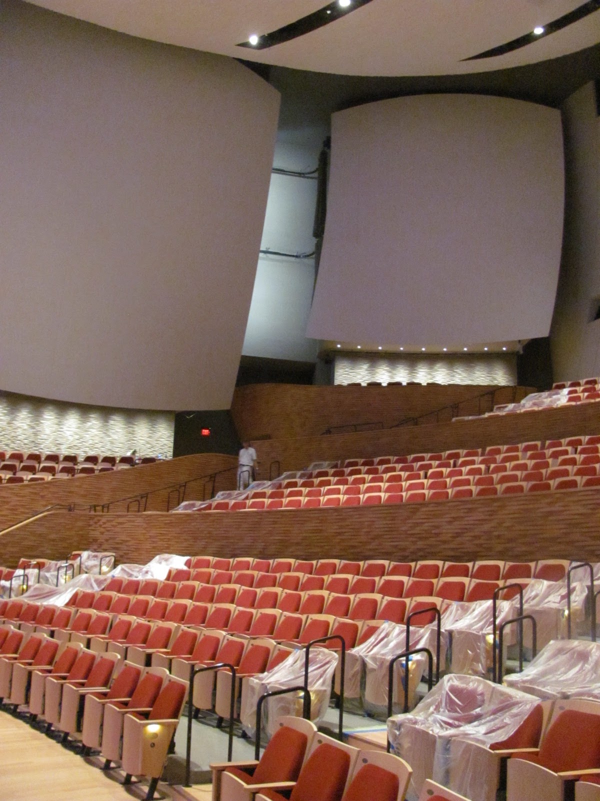
The interior surface of this shell is a riot of shapes and
textures. The outward-tipping walls that frame the seating terraces are covered
in a layers of horizontal curvilinear wood strips -- their random curves taken
from seven different sine curves to create the optimal irregularity. The
surfaces of the plaster clouds -- actually prefabricated fiberglass reinforced
concrete panels with a nubbly surface -- may look plain, but the walls beneath
them are stamped with another pattern that looks like a vision of quantum
space, where Newtonian time and space have gone awry. Even the backs of the
seats rise and fall in an irregular rhythm.

The purpose of all this colliding diversity is to create micro
and macro surfaces to bounce and spread sound evenly and with fidelity to all
parts of the hall.
In fact what we are looking at in this collision of patterns is
the complexity of the science of sound itself expressed in architectural form.
The jagged patterns of a sound wave on an oscilloscope may seem random to a
layperson in the same way -- but functional science underlies it.
The same creative inspiration could have improved the exterior.
Set in the middle of the Stanford Arboretum, the diversity and irregularity of
biological sciences -- the textures and colors of barks, the angles of branches
akimbo, the range of scales from micro to macro, from leaf to trunk -- could
have inspired an exterior form as vivid as the hall's interior. It could have
been a concert hall both in and of the woods.
The exterior's rectilinear colonnade and elliptical dome
primarily a familiar, reductive Modernism. Still, it makes some tentative moves
to complement its natural surroundings. The random tilted mullions in the glass
walls surrounding the lobby echo the angles of tree branches. The large
truncated elliptical cone is set at a diagonal rather than facing straight out
to the formal axis of Palm Drive, avoiding the central monumentality of old
Stanford Museum facing it. It is a building with many entries and no single
dominant facade.
But the dome's oval shape diminishes weakly in perspective,
becoming a shapeless, indistinct bulge. The architects attempted to articulate
the dome by slicing it into two halves, with an inset plane between the edges
of the halves (the perfect place for a tile mosaic mural). Nonetheless it falls
short of the vivid organic geometries of the 2009 Menlo-Atherton Performing
Arts Center by Hodgetts + Fung, or the great Brazilian Modern architect Oscar
Niemeyer (who died last month at 104 years.)
Likewise the flat stucco of Bing Hall's exterior deserved more
study. Stucco is a fine and noble California material, used effectively for
monumental buildings by architects from Bernard Maybeck (the Palace of Fine
Arts in San Francisco) to Charles Moore (Kresge College at UC Santa Cruz.) But
it requires a sure confidence that it can be an expressive material in its own
right, not just a budgetary necessity in place of more expensive stone.
Bing Hall's exterior deserved the same attention as the interior
hall. This is a major building setting the tone for the campus' cultural sector
(including a new art museum and an art and art history building) planned in the
next few years. But the current whirlwind of construction should not make
Stanford ignore the high standards set by its best buildings (by Wurster
Bernardi and Emmons, Edward Durell Stone, John Carl Warnecke and Shepley Rutan and Coolidge) that
balance utility without shirking humanity.
Subscribe to:
Posts (Atom)